Match 2 Play Squash - Mobile App
This app will instantly connect squash players who happen to cross paths or near by.
This will help to connect with new squash players and create opportunities to play more matches.
Role
Lead & Solo designer— UX Design | UI Design
Method and Tools
User and Market Research | Persona and Scenario | Wireframing | Low-fidelity Prototyping | High-fidelity Prototyping | Sketch | Invision | User Testings
Project Background
Being an avid squash player in the city, I encountered difficult moments where I could not find similarly-experienced partners to play a squash game, outside of attending tournaments or league matches. This problem inspired me to design a mobile app to connect squash players that I crossed paths with in order to play more matches
Problem Statement
It is not easy to find a squash player, who is at a similar level, to play with nearby.
Goal
Created a mobile app to solve this problem. The app instantly connects squash players who are within a set mile radius. This helps connect new squash players and create opportunities to play more matches than ever before.
Video presentation
D I S C O V E R Y
User Interviews
I interviewed two groups :
Group A : Squash players
Group B : Newbies
User Needs
Comparative Analysis
I started to look at other apps that is similar to my concept. It turned out to be similar to a dating app.
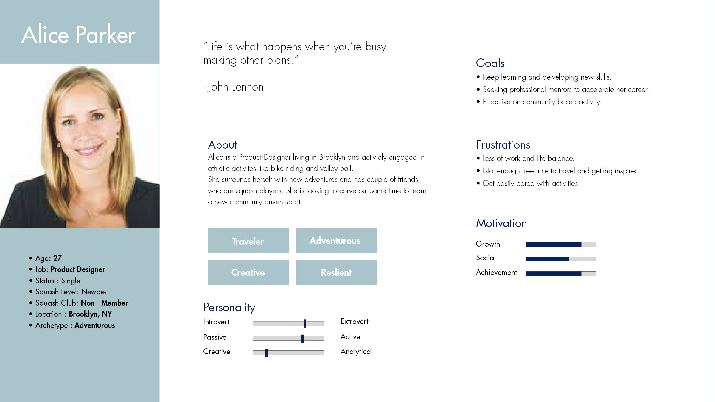
Personas
3 types of Personas;
Alice Parker : A newbie
Donna Jones : A beginner
San Patel : An advanced player
I D E A T I O N
Paper Prototyping
I divided the path way by starting to ask the question :
Have you played squash ?
If the answer is No, the user is categorized as a ‘NewBie’.
It navigates the journey to select methods to learn squash and connect with other newbies.
Have you played squash ?
If the answer is Yes, the user is categorized as a ‘Squash Player’.
It navigates the journey to find other squash players based on their skill level.
Low fidelity Prototyping and Testing
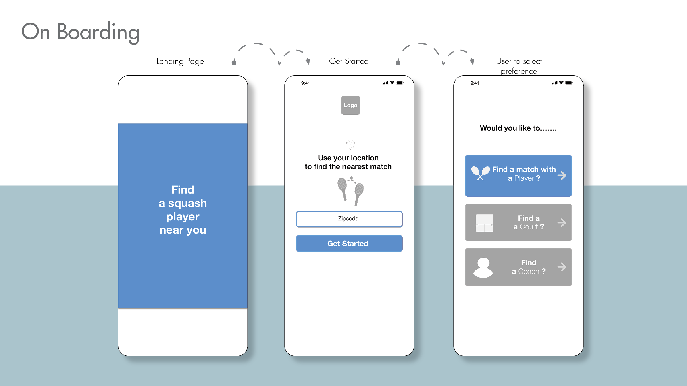
Based on interviews, I simplified the on boarding process by selecting a location and having the users select their choice.
Let’s say the user selects find a player.
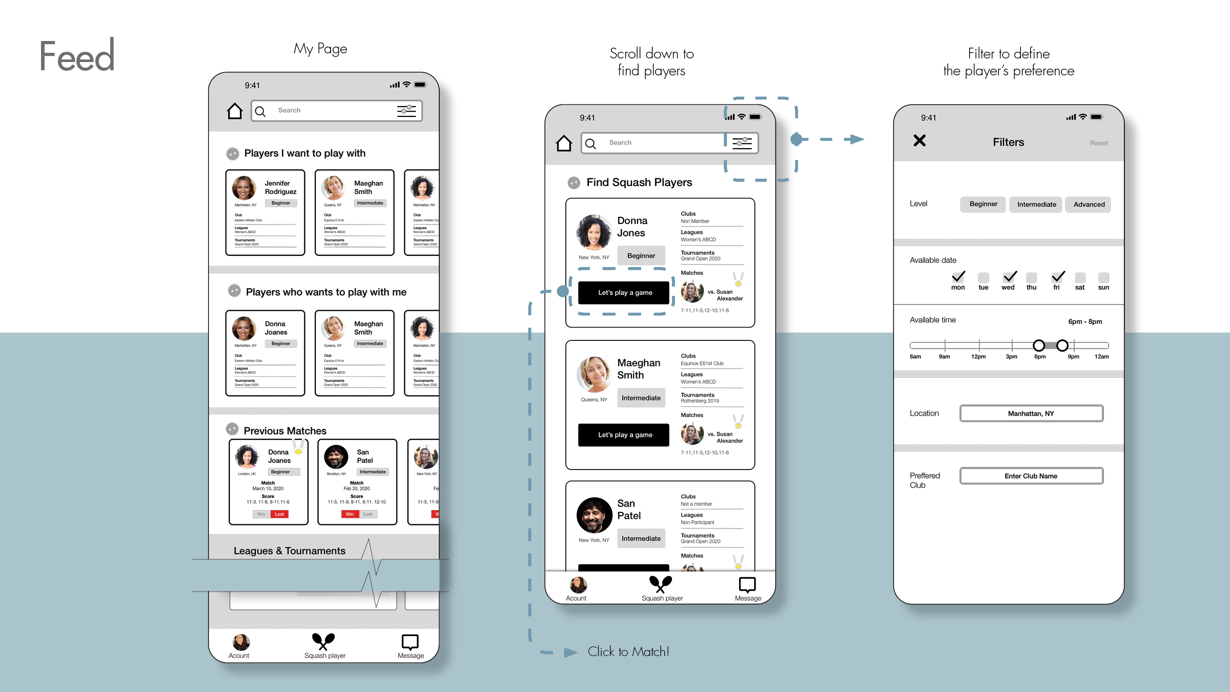
User gets an experience browsing the app. Once the user selects the player, the app requires the user to join.
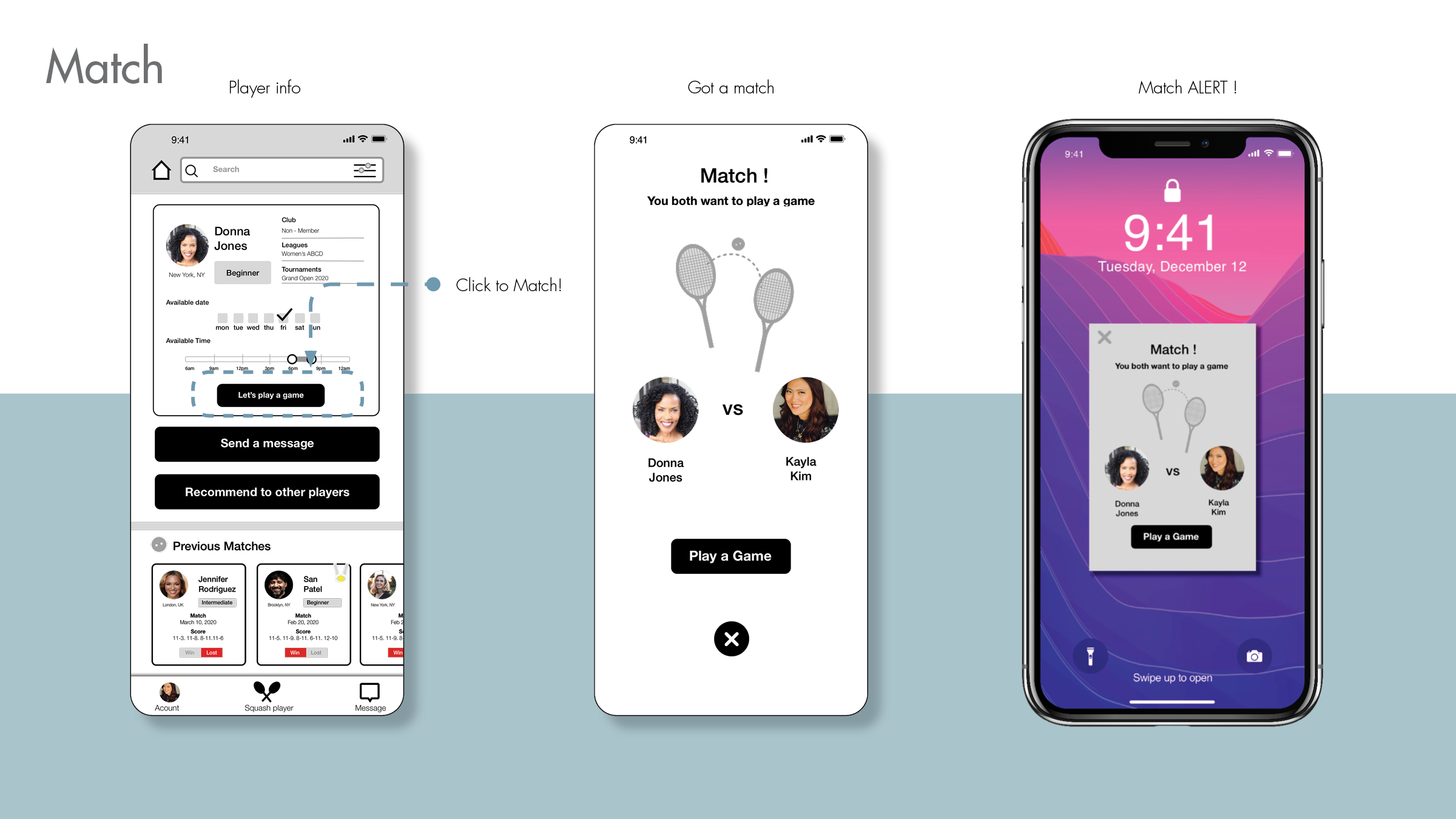
After login, user gets to select a player. When the opponent agrees to play, the player gets a match.
Players connect via chat on the app and arrange a time and court based on their convenience.
User testing Feedback
What do they like?
Clean navigation,
Pain Points ?
What is the main purpose, finding a player?
Arranging courts are complicated, since most of them are private clubs.
Suggestions
• Revisit the original concept and focus on ONE function ; finding a squash player.
• First page to show the number of players around your area.
• Change titles to ‘ Players I want to play with’, ‘Players wants to play with me’
• Login with ClubLocker to have all the squash player’s info.
• Partner with ClubLocker or US Squash to gather members.
• All players should show, especially in filter:
- Player’s Level.
- Player’s Club member info, ( if they have a membership ).
- Player’s preferred time & day.


